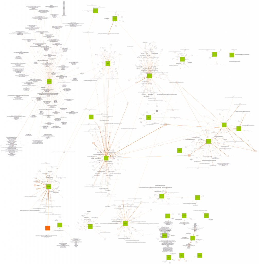
What you see above is a visualisation to who (some of the) EU funds were awarded in 2009*. It is just a little experiment, a proof of concept, to see if open data available from the EU can contribute to the fight against corruption.
The map is a very practical way to demonstrate that the European public could do more to prevent corruption and the misuse of public (EU) funds (i.e. taxpayers money) if it had more and better open data about EU funds and its beneficiaries.
The concrete idea for that map came to me thanks to a productive intersection of (a) two projects I stumbled across via Twitter these days, (b) my transparency in the EU institutions advocacy work with Transparency International here in Brussels, (c) my preparations for the Personal Democracy Forum (PDF) Europe in October, and (d) my own doctoral research.
The first of the two projects mentioned above is GovWild, which I found via the German Open Data Network. In this project from my home university in Potsdam, a group of scientists is linking data from different public sources, including EU funds, national party donations and US spending data, into one big data set available for search and analysis.
The second project (via @delineator), which gave the final impetus for my map, is Palentir and this must-see project video on how to use connections of public data and information to detect fraud and corruption risks. After I watched the video I retweeted it, and one of our followers, @ErikWesselius, wrote: “I doubt if similar #govt opendata is available in the EU…” which made me think.
And since I will speak for Transparency International at the Personal Democracy Forum Europe in Barcelona in October, giving an EU perspective on possibilities to use (online) technology to fight corruption, and since I also have been experimenting with network visualisation software for my academic research in the last weeks I thought I’ll give it a try.
You can see the result on the map above, a map with about 500 beneficiaries of EU funds (or groups of beneficiaries) created with open data provided by the EU Commission.
On the map, beneficiaries are linked to the responsible departments of the EU Commission (the green rectangles) and the amount of money they were awarded through one or several grants (in million Euro) can be found on each edge between departments and beneficiaries.
This visualisation is just a small and selected extract of the whole data set, yet it covers quite important amounts of money (see below). And more importantly, I feel it is much more interesting to start looking into EU funding in this kind of visualised presentation than it is in the standard text search available on the Commission website.
The networked presentation makes you think about the connections and concrete flows of money, it gives you a a quick visual glimpse at who receives what kind of money in what amounts. And by looking at the image you start asking questions, questions like:
How can it be that the Europe Aid Cooperation Office seems to pay several hundred million Euros to beneficiaries that are classified “confidential”? (Look it up on the map!)
In order to be able to ask these and many other questions we need good and freely available data in usable formats – and we also need to make use of it as soon as we have it.
The map is just an example of what one can do with open data, and the way it is build is also just one of many possibilities. I hope it serves as a trigger for you to try your own stuff with this and other data.
In the EU, compared to the US, we still have a long way to go when it comes to funding transparency – see for example my post on EU structural funds transparency – and open data projects, and so initiatives like FollowTheMoney.eu and are filling holes that governmental institutions have left open so far, holes that nevertheless need to be filled better sooner than later!
Ronny Patz, Advisor to the Transparency International EU Liaison Office
* For those interested, here is what I did to arrive at the final map:
I downloaded the publicly available data on EU funds handled by the Commission (about 20% of the EU budget) for 2009 as an Excel sheet. This data does not show the amounts paid but the amounts awarded!
In a next step I ordered the data by the amount of money awarded and then opened the changed Excel file with the yEd Graph Editor. I created a graph based on a link list (links between responsible department and beneficiary) taken from the 1000 first data sets i.e. the 1000 largest amounts of money awarded. Then I played around with the graph with yEd and visone (both free network analysis and visualisation tools with different advantages and disadvantages).
Where the same beneficiary was awarded money from the same department several times, I merged multiple edges into one edge, adding up the amounts of money on the merged edge (the sums on the edges show the amount of money in million €).
In the end, there were about 800 different beneficiaries or groups of beneficiaries on my map together with the responsible Commission departments. For memory and visual reasons I erased all those who only received money from the General Directorate for Research (about 300 groups of beneficiaries that are worth looking into separately because the amounts of money spent there are considerable) when creating the image for this article, leaving the final map displayed here with about 500 (groups of) beneficiaries.


 Connect with us on Facebook
 Follow us on Twitter